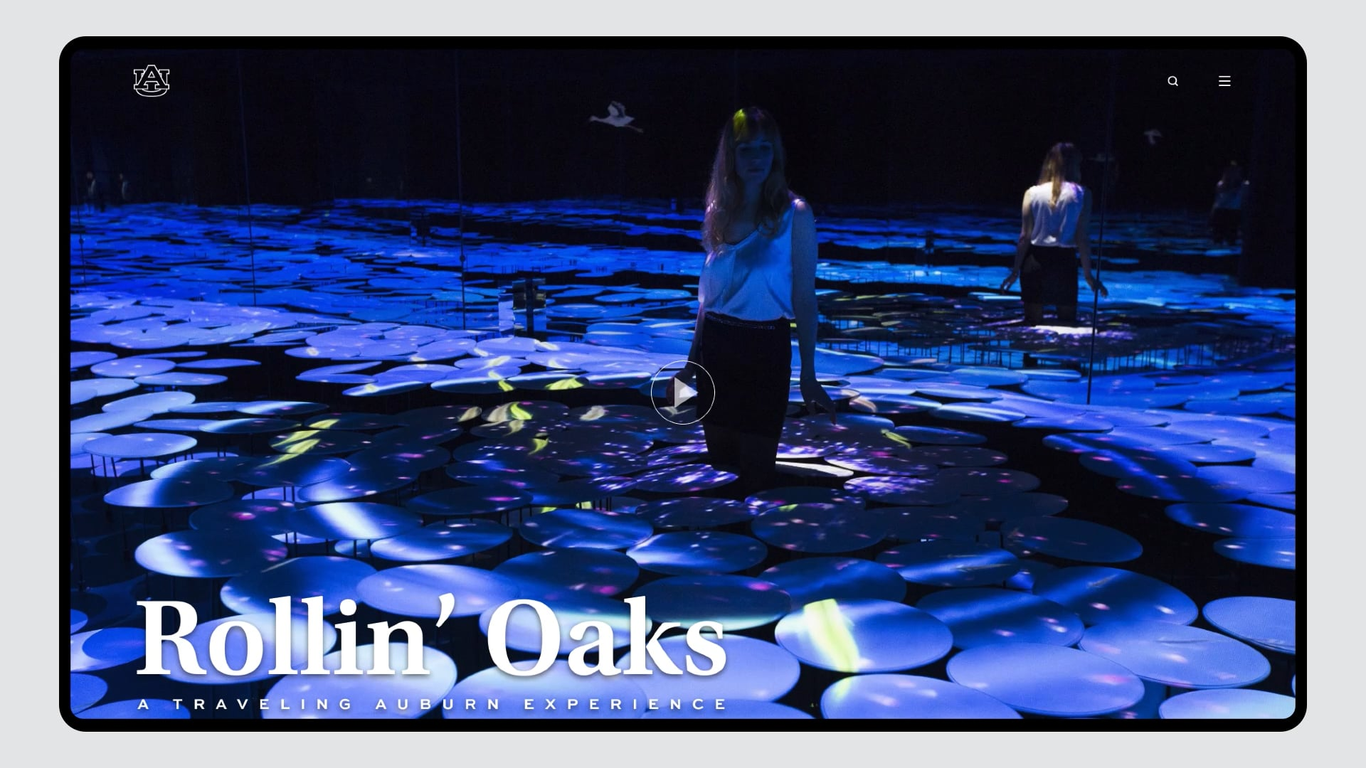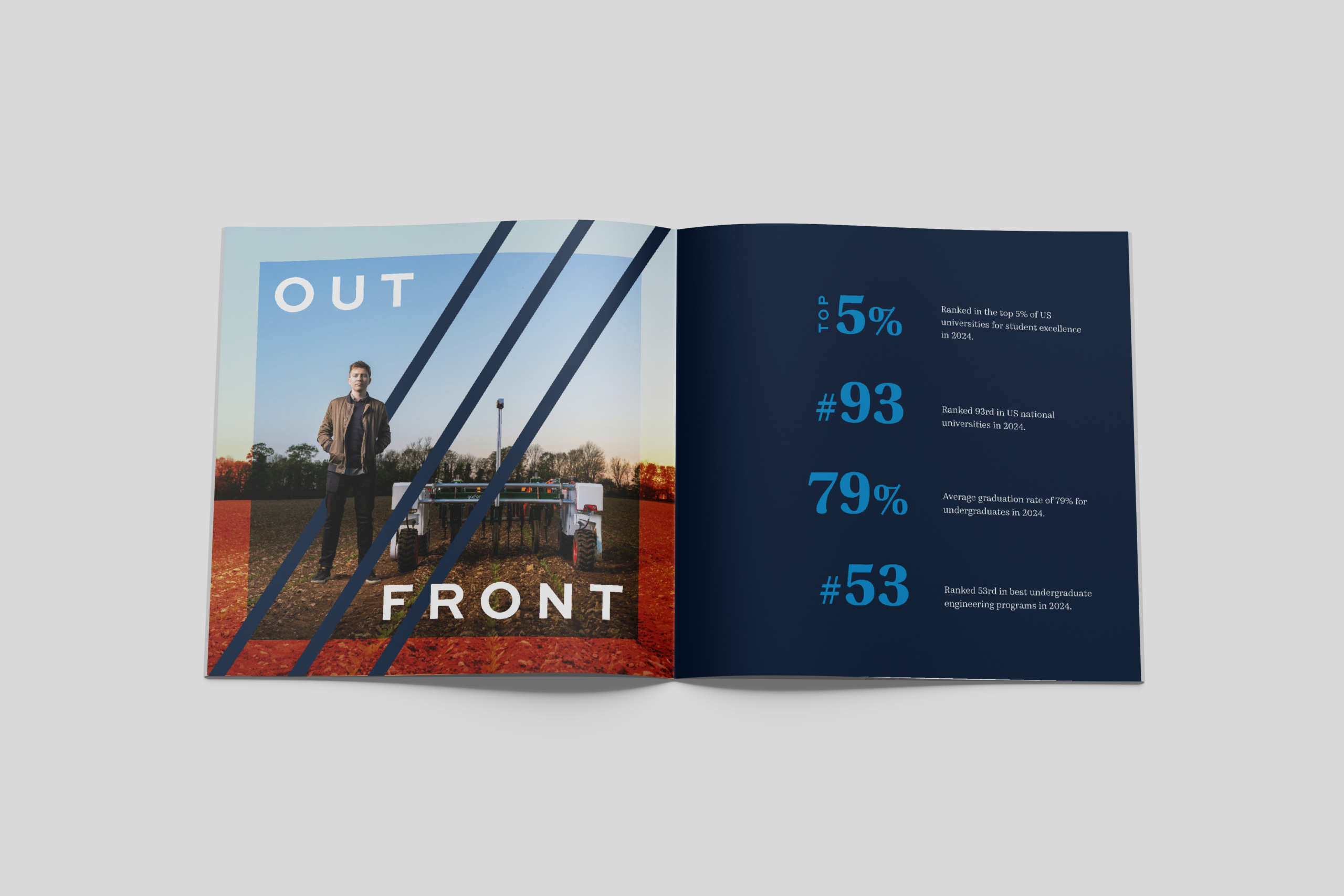
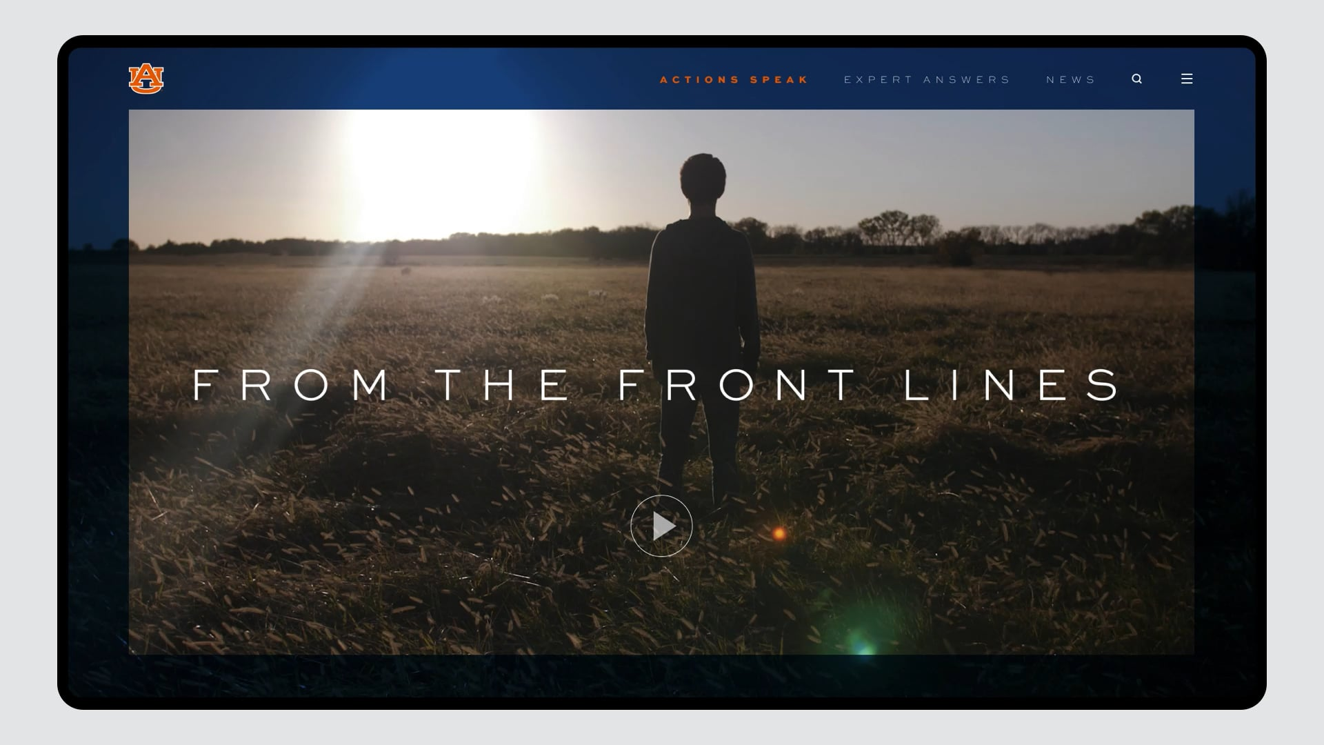
Auburn’s “Pillars” became less rigid and more functional, interacting with photography and typography in dynamic ways.

Auburn University
Auburn, forevermore
Auburn University is a school defined by their creed. The kind of place that does important work but doesn’t boast about it, that achieves incredible things but doesn’t seek recognition for them. Where everyone knows there is something about the place that can’t be articulated. So how does an institution which prioritizes action share their story with the world? They find their voice.
Our brand platform positioned Auburn’s unwavering values as the root of their strength. We refreshed the existing Auburn brand to stand out in a crowded landscape, enabling internal marketers and communications partners alike to tell the story of Auburn – outfront in their beliefs and unshakeable to their core, then, now and forevermore.
Services
- Branding
- Strategy

Brand Platform
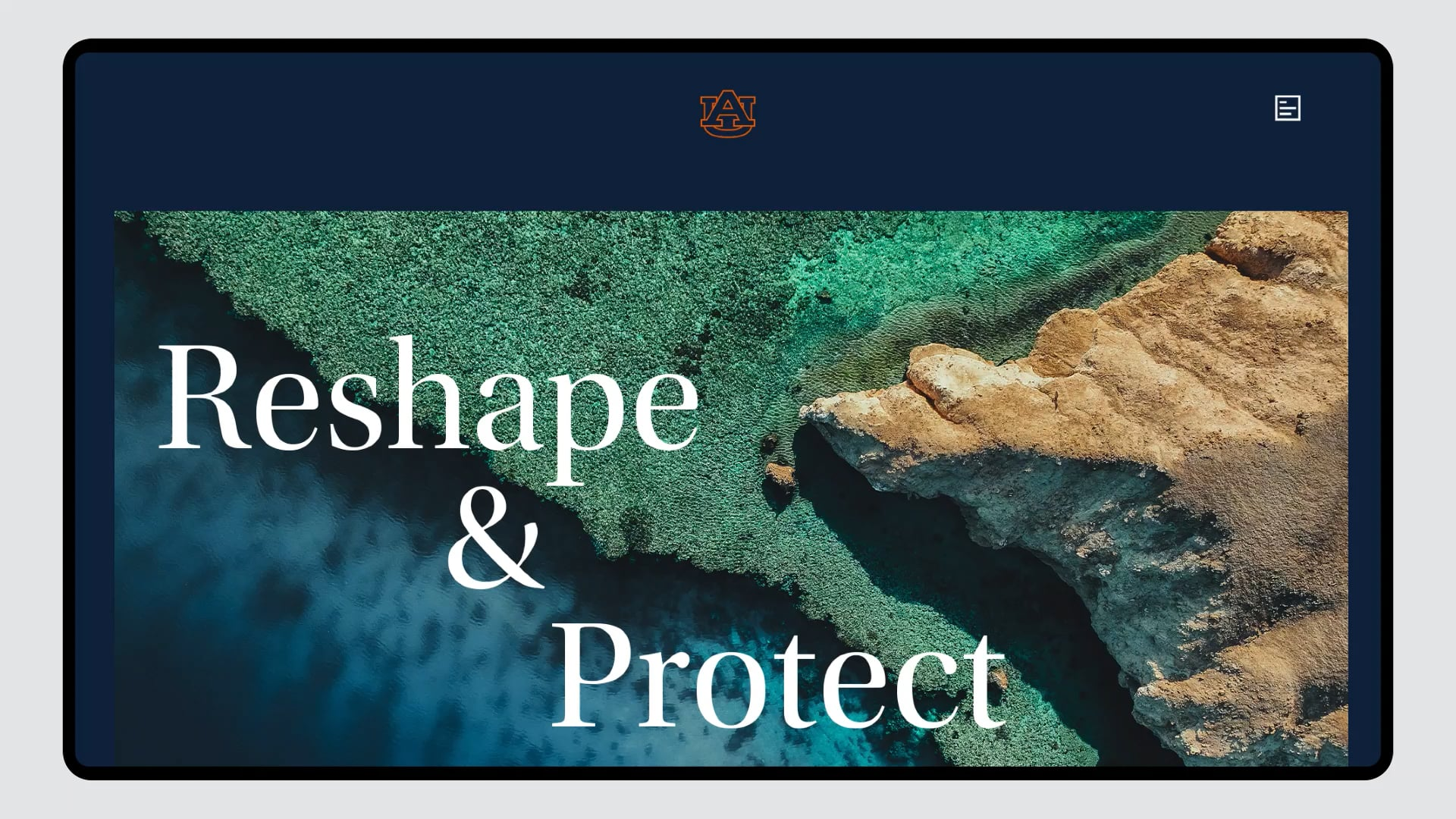
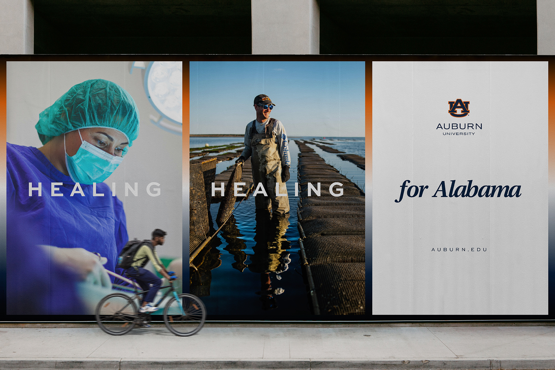
Using Auburn’s existing color palette and foundational design elements, we built a visually rich, modern brand that showcased actions, celebrated community, and was able to speak volumes while saying little.











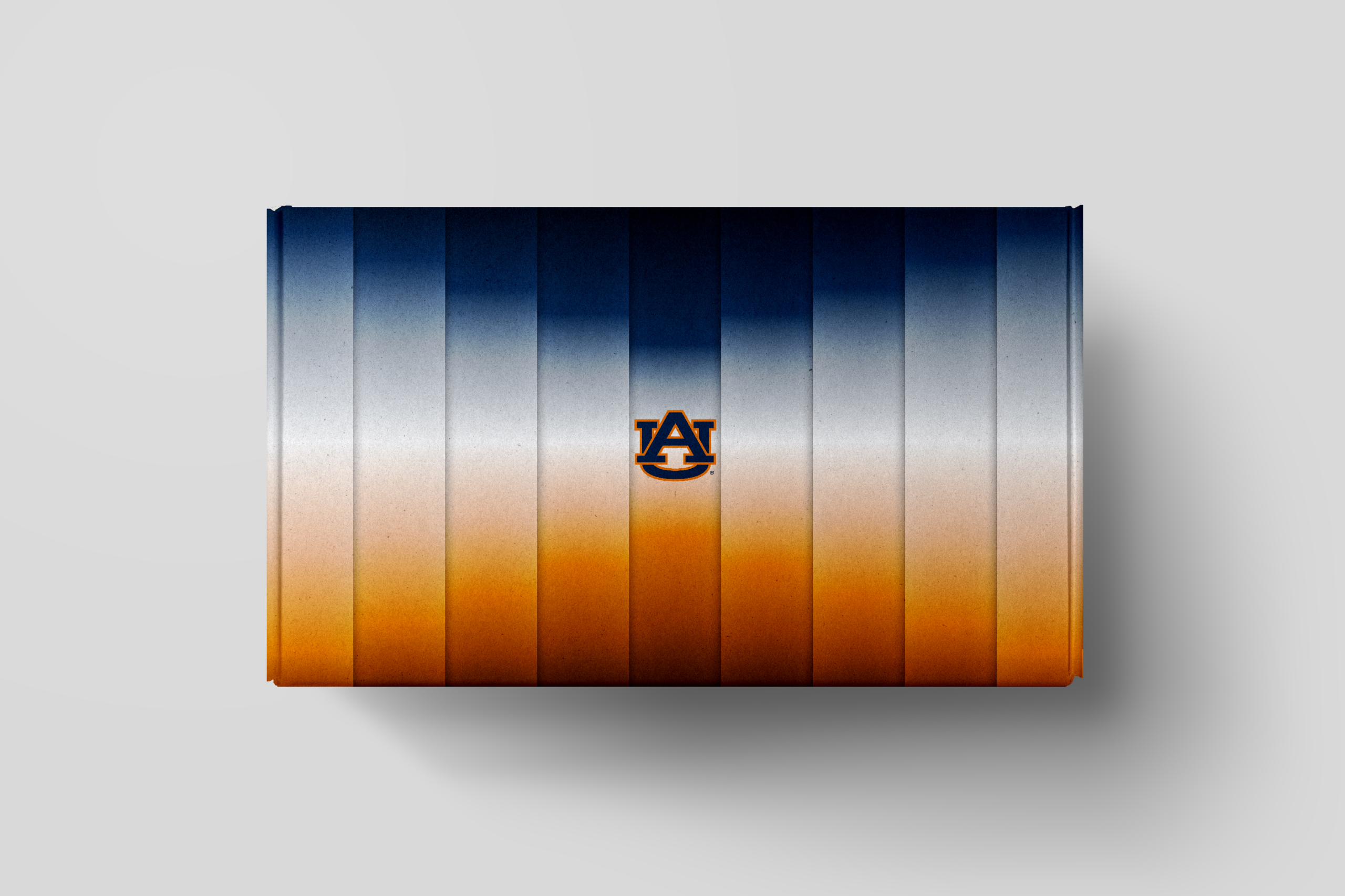
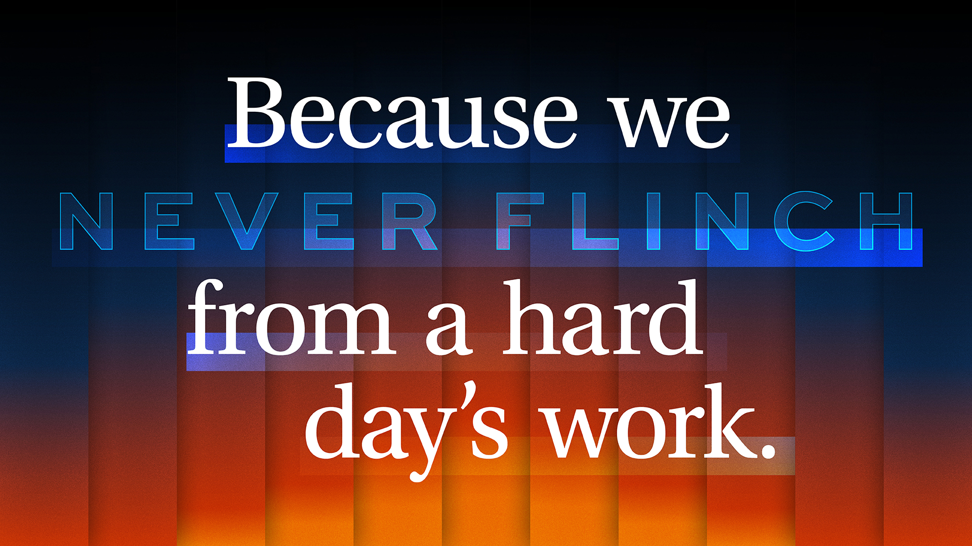
The traditional orange and blue was embellished with gradients and grit, to add a sense of motion and action to their classic palette.

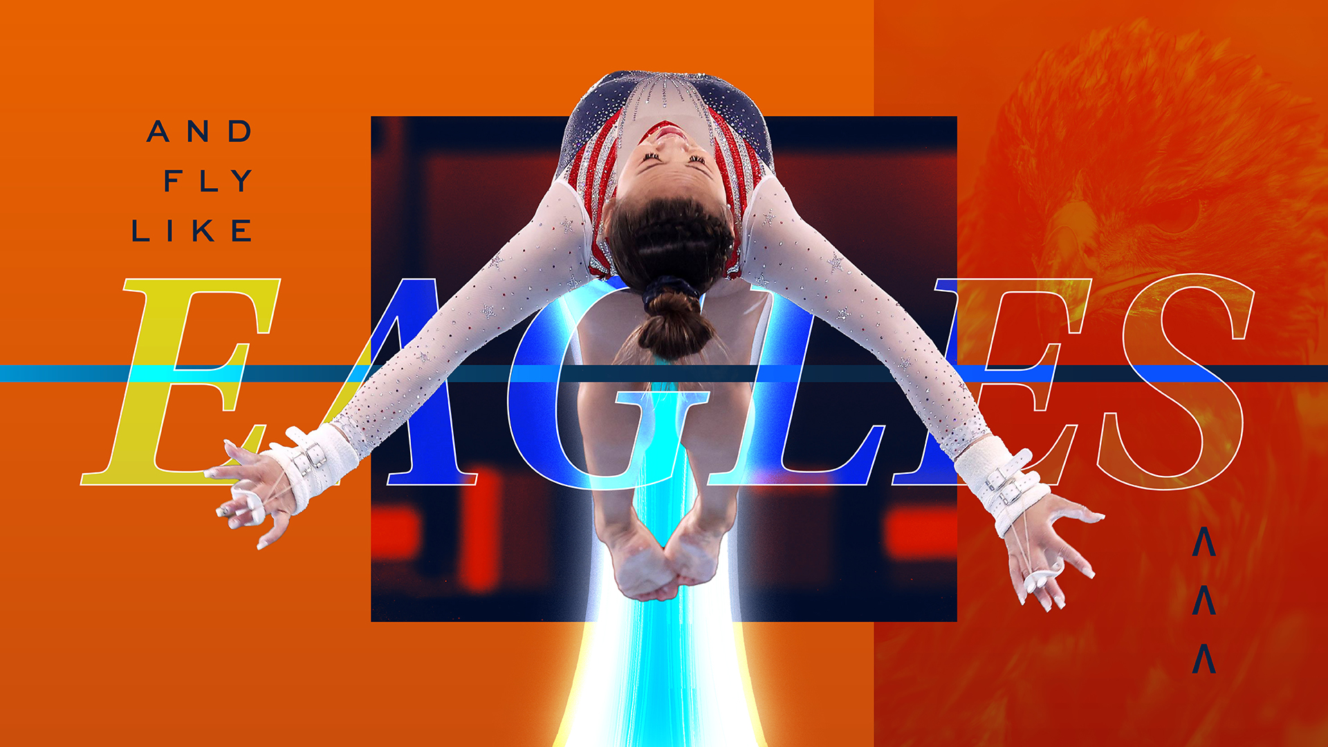



Shared experience and communal joy were core to the message for students and alumni. Because even a school that prioritizes hard work needs a playful side (especially a school that shouts “War Eagle” at a tiger).