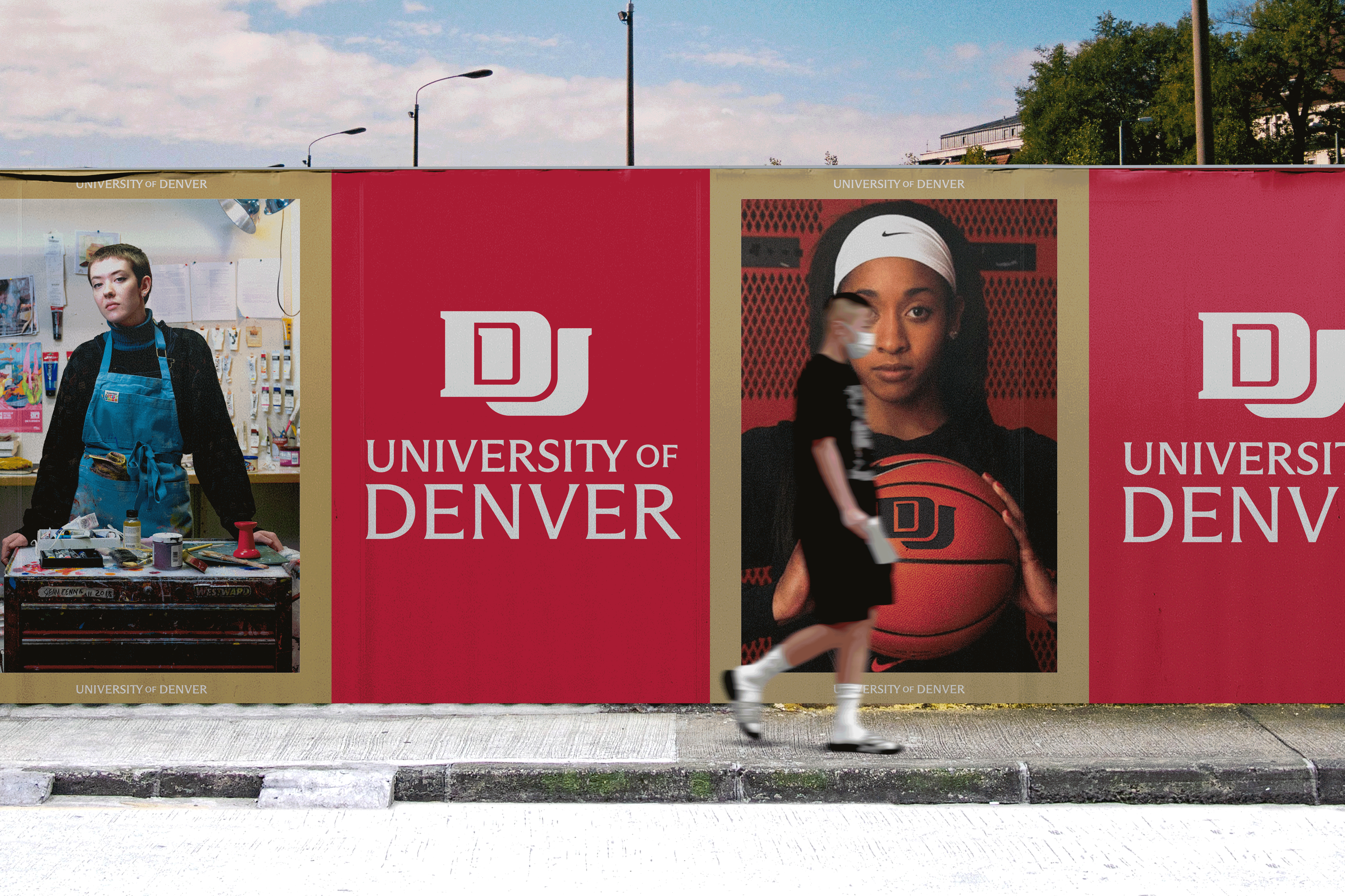
DU updates their DU (logo that is)
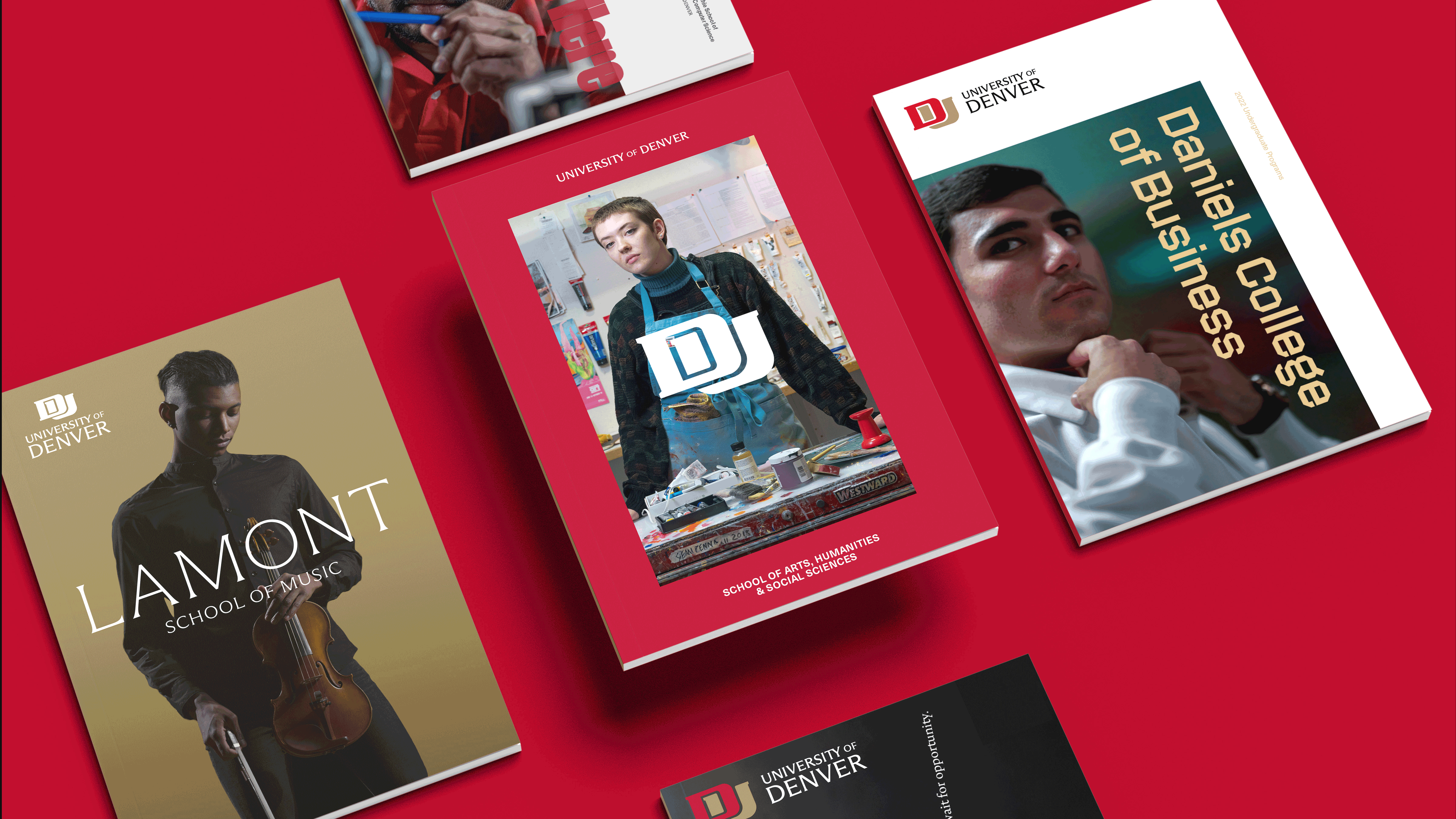
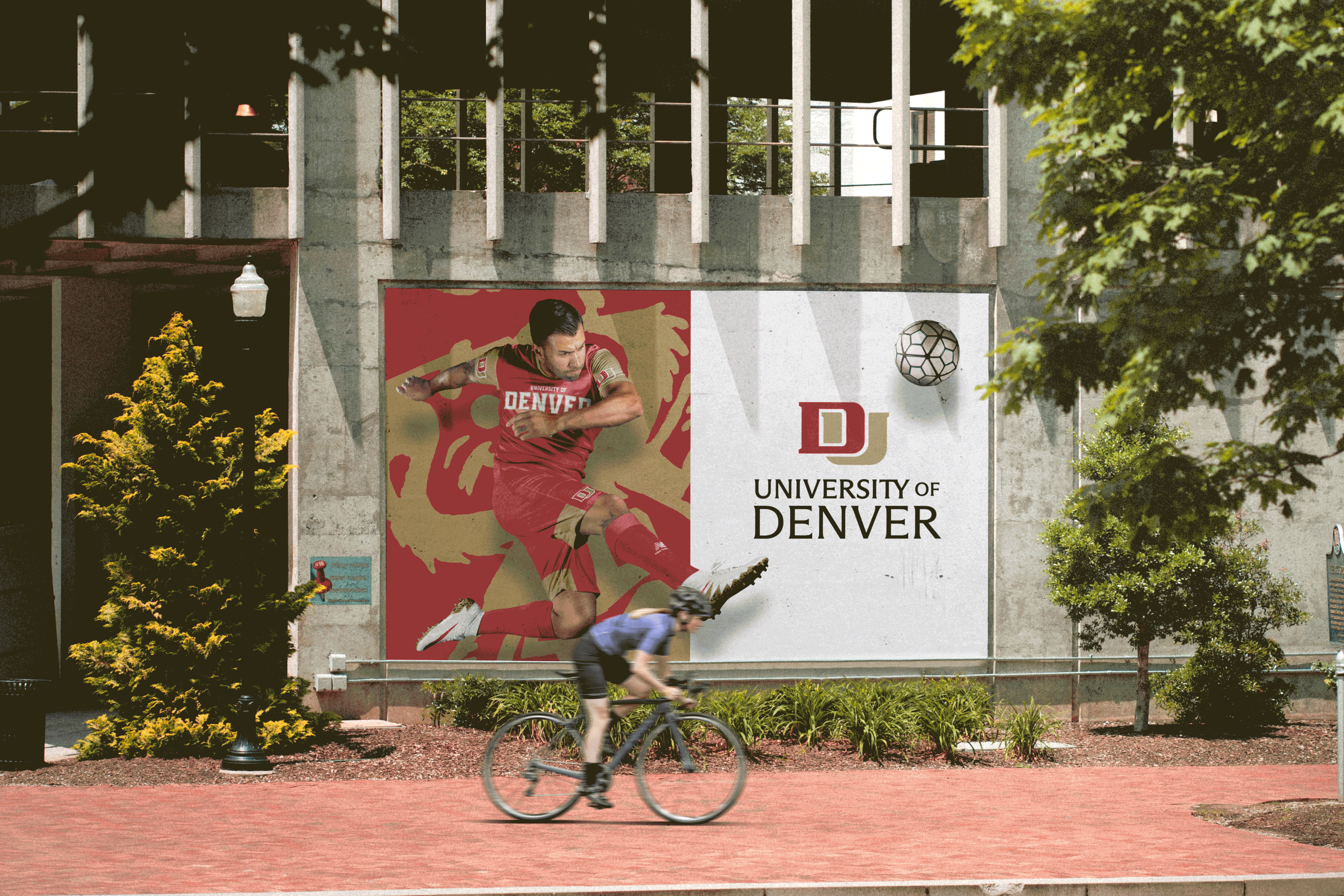
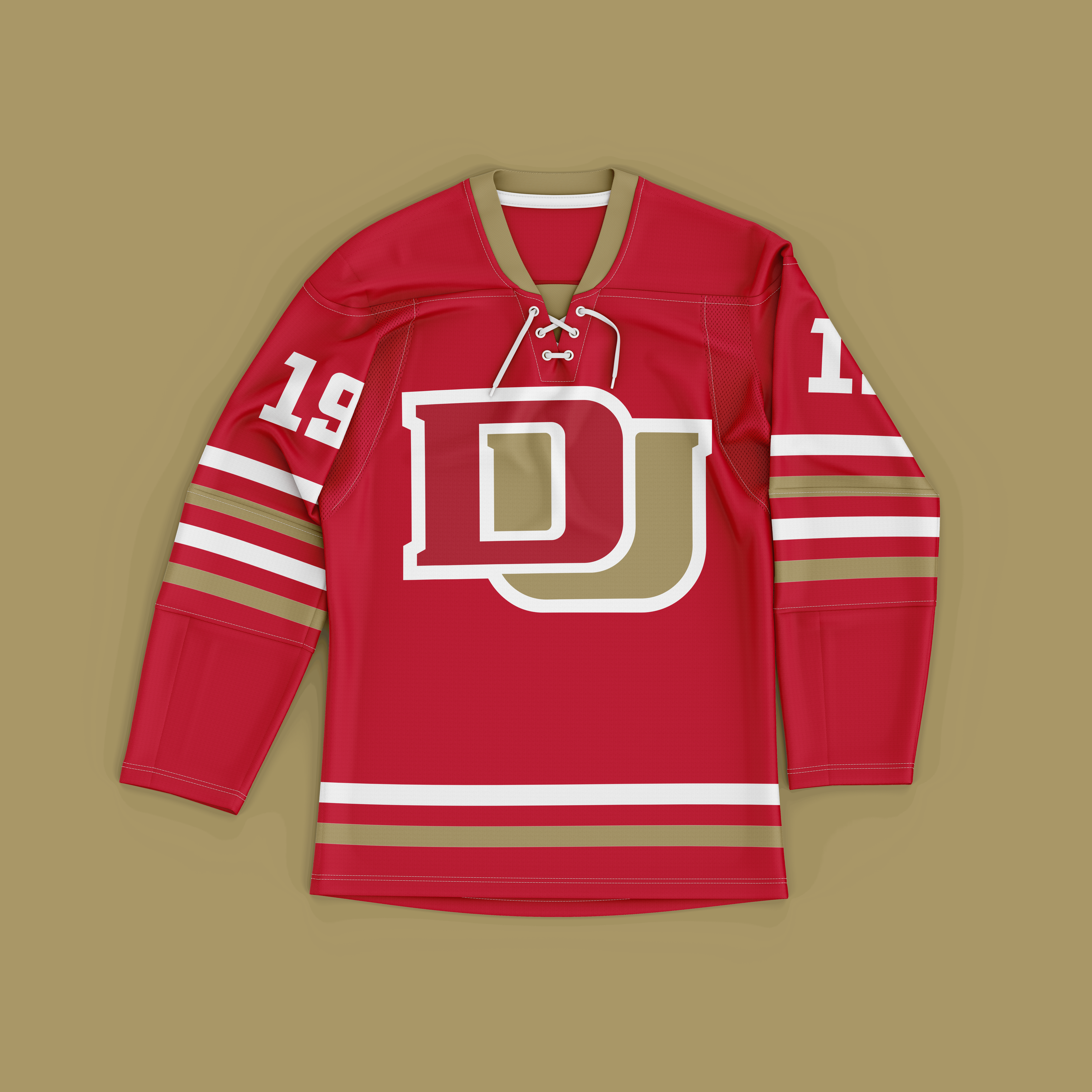
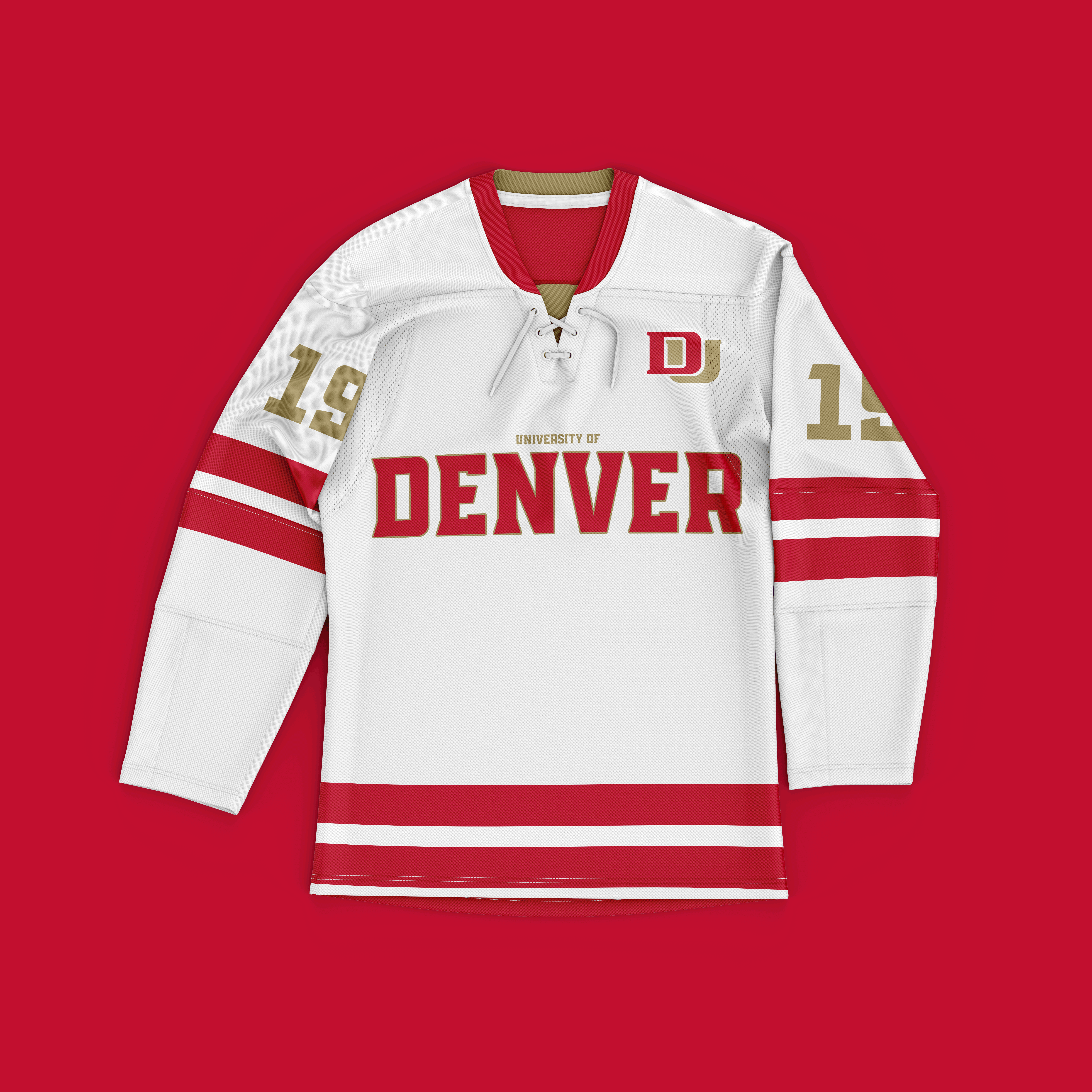
The University of Denver continues to raise its national reputation, garnering momentum with a campus expansion that includes the newly acquired Kennedy Mountain Campus, the announcement of their new 4D Student Experience and the 2022 Men’s Hockey Championship victory. The time had come for an identity refresh. While the existing shield will be used to portray the history of the University, the new mark is intended to further unify the brand and modernize its design.
Tackling a university identity is always a delicate dance between its past and its future. In the case of DU, previous versions of the identity consisted of complex seals or crests that make modern implementation difficult or not impossible. That is where we were able to collaborate closely with DU’s Marcom team. We were able to leverage their knowledge of the existing university brand and the elements the DU alumni felt the most affinity towards—knowledge like that is invaluable.
We got to work with on a new, bold wordmark that stands out amidst the rest in the region and the nation, pushing the University into their next chapter – while respecting the legacy of so many that had come before.
“The revitalized logo is an evolution of our current interlocking DU mark, a result that allows us to capitalize on the brand equity we’ve established while also resolving usability challenges we have experienced with some of our current marks. …. Our goal is to move the University forward by rising in the rankings, engaging new markets more meaningfully, building a robust student pipeline and creating an authentic narrative that resonates with all our audiences.”
– Renea Morris, Vice Chancellor of Marketing and Communications
